PASM MODES:
P mode is useful when something happens and there is no time to set up the camera. A mode is useful when you want an image that has a shallow or deep dept of field. S mode is useful when you want to either capture motion and freeze it in time, or to portray motion with motion blur. M should be used when you do not want the image to have a gray tone.MATRIX, CENTER WEIGHTED, SPOT METER:
Matrix should be used when you don’t have time to use spot meter. When you use this though, it turns the picture into a gray tone. Center weighted should be used when you don’t not have much time, but you don’t want the entire picture to be gray. Spot meter should be used to have more accuracy in the image. If you do not have much time to meter the image, this mode is not the ideal tool to use.
HISTOGRAM:
The histogram allows the photographer to confirm that his or her picture to have equal amount of black and white, and to make sure that details can still be seen. If a spot on the image is too black or too white, details will not be noticeable. Usually it is best for the histogram to be evenly spread, unless the photographer thinks that more or less light will enhance the subject.
The histogram allows the photographer to confirm that his or her picture to have equal amount of black and white, and to make sure that details can still be seen. If a spot on the image is too black or too white, details will not be noticeable. Usually it is best for the histogram to be evenly spread, unless the photographer thinks that more or less light will enhance the subject.
DESCRIPTION:
The elements chosen were texture and complementary colors. Both elements encourage the viewer's focus to be on the subject. Texture adds detail to an object, immediately making an object look more inviting. Complementary colors cause contrast in the image. This automatically alerts the viewer as to what is important in the image.NOTES:
Texture can add detail and value to photos, but it can also be a distraction. When taking pictures with texture, it is often best to have a deep depth of field. This allows more texture to be captured from further away. On the other hand, if a shallow depth of field is used and the focus is on a subject with high texture, the importance of the subject will be more clearly expressed.
RESEARCHED IMAGES:

This picture is an example of texture. The fur of the animal, possibly a leopard attracts the human eye, making the picture look more entrancing. The aperture seems to have been large, as some texture is out of focus indicating a shallow depth of field.

This picture also has texture. The photographer decided to use black and white photography. This can sometimes deliver the artist's message in a more powerful way. The artist intentionally used a shallow depth of field, so the wood in front is in focus, while the back gradually fades away.

This picture is my personal favorite out of the three I have chosen. The water is captured, but not completely frozen motion is still visible in this image. The red strawberry contrasts with the green background, making it stand out of the picture.
TEXTURE CONTACT SHEET:

When looking for texture possibilities, I looked for natural formed scenes. I opted for images with a shallow depth of field, so as to direct the viewer's focus to subject.
COMPLEMENTARY COLORS CONTACT SHEET:

When I took pictures with complementary colors, I wanted to take pictures of nature. Unfortunately, I found that complementary colors were not as common as I had previously thought. Consequently, many of the pictures that I took of this element were of manmade objects.
FINAL SELECTION OF TEXTURE:
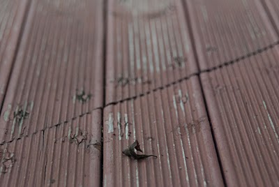
I have always preferred to take pictures of nature. When this picture was taken, it was the middle of the day. I was about to take the picture, but then I realized that it had potential in being darker. Therefore, I took pictures of it with a shallow depth of field, trying to fool the viewer's into thinking that it was taken during dusk. I took several pictures, until I was satisfied with this one. The texture in this image is the leaf, and the boards around it.

Some people might argue that this photo has no subject, or that the texture itself is not 'good'. I disagree. Most people never stop to appreciate their surroundings. The bark of this branch is cracked and broken because of the constant exposure to the elements. The designs on the bark itself are superior to any of that made by man.
FINAL SELECTION OF COMPLEMENTARY COLORS:

Out of the pictures I took, this is by far my favorite. I finally got a picture of nature, and the simplicity of this flower struck me. It was white with spots of purple. I was the only in a bush. I decided to use the purple to contrast with the green background so that the flowers would stand out. I also used a shallow depth of field so the background would not serve as a distraction to the viewer.

I took this picture because the red poodle contrasted with the green grass and the bushes in the background. The shadows under the bushes also provided contrast with the dog. The white reflections on the dog also serve as beacons, to which the human eye is attracted to.
DESCRIPTION OF LEARNING:
During this portfolio, I learned to pay attention to everything. Everything has potential; people just have to find it. I scrutinized everything I came across. I also realized that I had underestimated the power focus has on a subject. Having a shallow depth of field emphasizes the importance of subjects in a picture. Consequently, most of my pictures had a shallow depth of field.
DEVELOPMENT OPTIONS:
In the future, I might consider continuing to utilize a shallow depth of field. I will also try to take pictures of common objects, maybe some which are common in a household. I might also use a slower shutter speed, in order to illustrate motion.
No comments:
Post a Comment